
Role : User Experience Design Consultant
Client : Early-Stage FinTech Startup (Bootstrapped)
Expertise : User Research • Research Synthesis • Information Architecture • Interaction Design
Status : Work in Progress (MVP/POC Phase)
Overview
I kept running into the same puzzle. In India, paying for something is now almost frictionless : scan, tap, done. So why does everyone I talked to still feel completely lost about where their money goes?
That question is where Nudget started.
Talking to people, not just users

We conducted a brief questionnaire survey with 51 salaried professionals to gather initial insights across urban India, and a pattern showed up fast. Almost everyone had tried an expense tracker at some point. Almost no one had stuck with it. Seventy-eight percent had attempted to track their expenses and failed to keep it up.
It wasn’t laziness. Two things kept getting in the way.
First, tracking asks you to remember and the moment right after you’ve paid for something is exactly when you’re least likely to stop and log it. ‘I’ll add it later‘ quietly becomes ‘never.’
Second and more surprising to me, was how many people simply didn’t trust these apps with their financial data. The fear of a breach or misuse felt real and immediate, while the payoff of better budgeting felt distant and abstract. Trust was losing to convenience or rather, nobody had figured out how to have both.
This created a fundamental design challenge:
How might we create an expense-tracking experience that feels both effortless and trustworthy?
What was already out there
I went and used everything: Axio, Walnut, Cred, Splitwise, plain old Excel, Jupiter Pots.
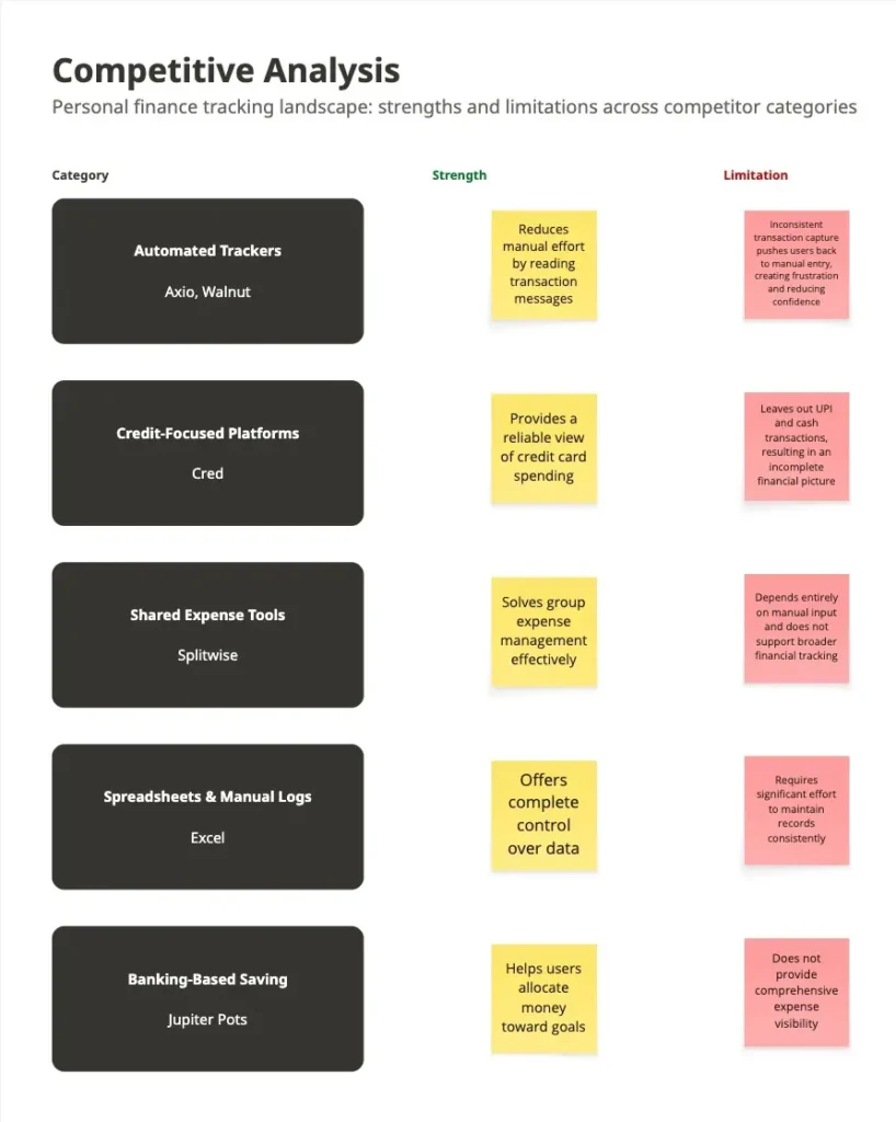
Laid out like this, the gaps stopped looking random. Every competitor had solved for one thing and quietly given up on another.
Axio automated UPI capture but processed it on their servers, so the moment you fixed convenience, you lost privacy. Excel and manual trackers protected privacy perfectly, by asking the user to do everything by hand. So the moment you fixed privacy, you lost habit formation. Cred worked well but only for credit cards, leaving UPI and cash invisible. Splitwise solved for shared expenses but nothing else.
| Competitor | Primary Strength / Use Case | Tracking & Automation | Data Privacy | Key Weakness |
| Axio / Walnut | Automated UPI tracking (attempted) | Inconsistent fetches; forces manual backfill | Processed on app servers (low privacy) | Broken promise of automation creates high friction |
| Cred | Reliable credit card tracking | Excellent for cards; completely ignores UPI and cash | Not specified | Leaves the user’s financial picture fundamentally incomplete |
| Splitwise | Managing shared household expenses | Entirely manual entry; lacks holistic tracking | Not specified | Manual entry only; not built for personal tracking |
| Excel / Daily Expenses Manager | Complete flexibility and local data control | Zero automation | Local storage satisfies privacy-conscious users | Heavy time and cognitive burden of manual entry |
| Jupiter (Pots) | Segregating funds at the source | Not a comprehensive expense tracking solution | Not specified | It is a banking feature, not a holistic tracking tool |
No one had tried to hold automation and privacy in the same hand. That became the bet: local-first processing, so the convenience of auto-capture never had to cost the user their trust.
Three kinds of people, not three age brackets

Instead of slicing users by demographics, I grouped them by behavior.
Type 1
Passive trackers roughly 35% of respondents
- wanted visibility but no upkeep.
- needed something that worked quietly in the background.
Type 2
Manual organizers roughly 40% of respondents
- wanted control and were willing to put in effort but eventually burned out maintaining records across five different payment methods.
Type 3
Privacy-conscious users roughly 25% of respondents
- had opted out of the category entirely because nothing on the market took their concerns seriously.
That last group (Type 3) became our focus. Not the largest segment but the one every competitor had written off and the one a trust-first product was actually built to reach.
Building Nudget
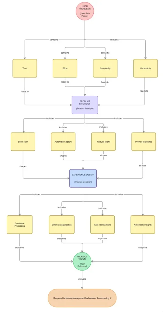
The brief in my head became simple: make responsible money management easier than avoiding it.
Four decisions followed from that.
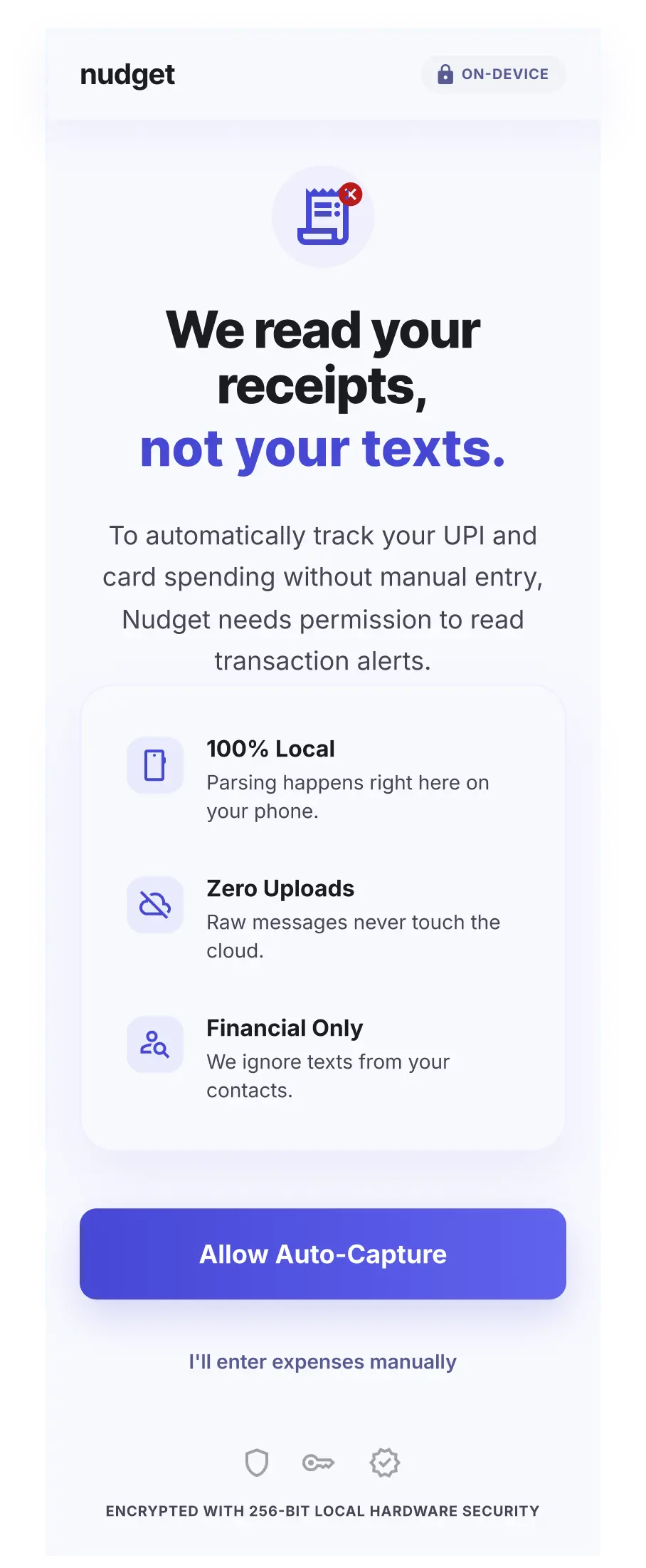
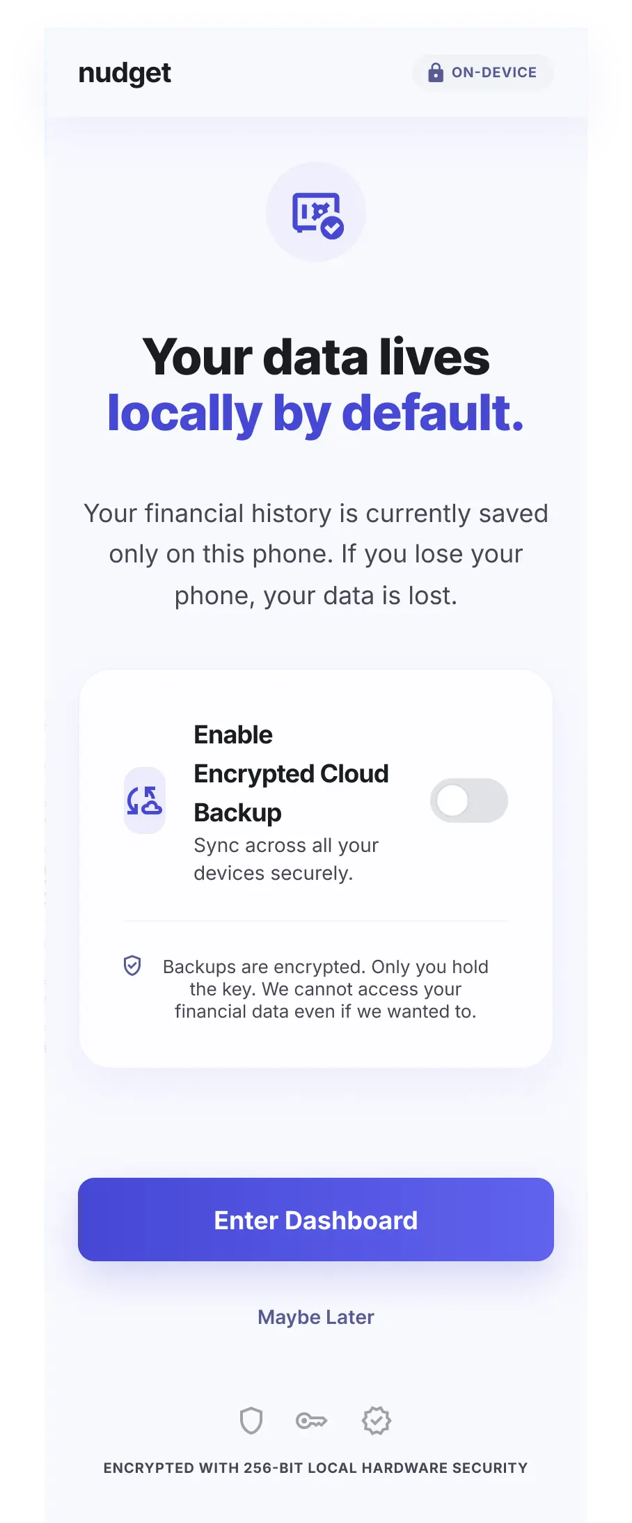
Trust had to be architectural, not a line in the marketing copy, so transactions get processed locally on the device, and permissions are asked for contextually instead of upfront and all at once.
Remembering had to stop being the user’s job, so Nudget quietly captures eligible transactions itself.
Categorizing had to stop being manual busywork, the system learns from recurring merchants over time.
And the dashboard had to stop being a wall of numbers.
People don’t need more data, they need to know what to do with it, so the design leans into patterns and progress over raw charts.
The goal was not to create another expense ledger.
The goal was to make responsible money management feel easier than avoiding it.
Where it got challenging
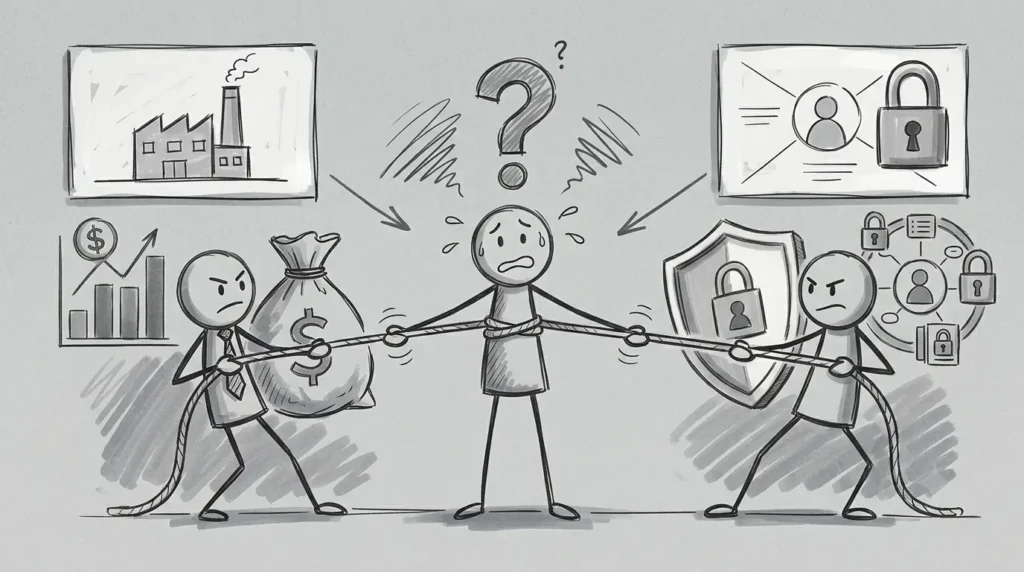
A. External tension (business vs. privacy)
Midway through the project, the right decision stopped being the easy one.
Keeping all data on the device was non-negotiable, it was the foundation of the product. But that also meant giving up the centralized user data that many fintech startups rely on to improve their products and impress investors.
It raised a fair engineering challenge too: how do you make the product smarter, recognizing merchants and learning spending patterns when the server isn’t part of the loop?
And beneath that was an even harder question.
We were designing for people who already distrusted finance apps. How do you prove you’re serious about privacy without asking them to simply believe your claims?
We never found a perfect answer. But we chose not to compromise.
The product remained local-first, permissions stayed contextual and we accepted a smaller first release rather than trade away the trust we were trying to earn.

B. Internal design tension : The badge problem (motivation vs. empathy)
For a while, I thought gamification could solve the habit problem.
Streaks, badges, and small rewards seemed like the obvious answer. If tracking felt rewarding instead of repetitive, maybe people would stick with it.
We tested early paper prototypes with a small group of budgeting app users. The gamified streak mechanic didn’t survive contact with the group most anxious about money. It read as another way to fail, not a nudge to keep going.
For someone already avoiding their banking app out of guilt, a missed badge wasn’t encouragement, it was judgment.
That was when I realized gamification and empathy were pulling in different directions. One relied on rewards and consequences. The other asked us to remove judgment altogether.
So we dropped it.
Instead of pushing engagement, we focused on earning trust first. The product could always become more motivating later, but it couldn’t afford to make people feel worse from day one.
Designing the Experience
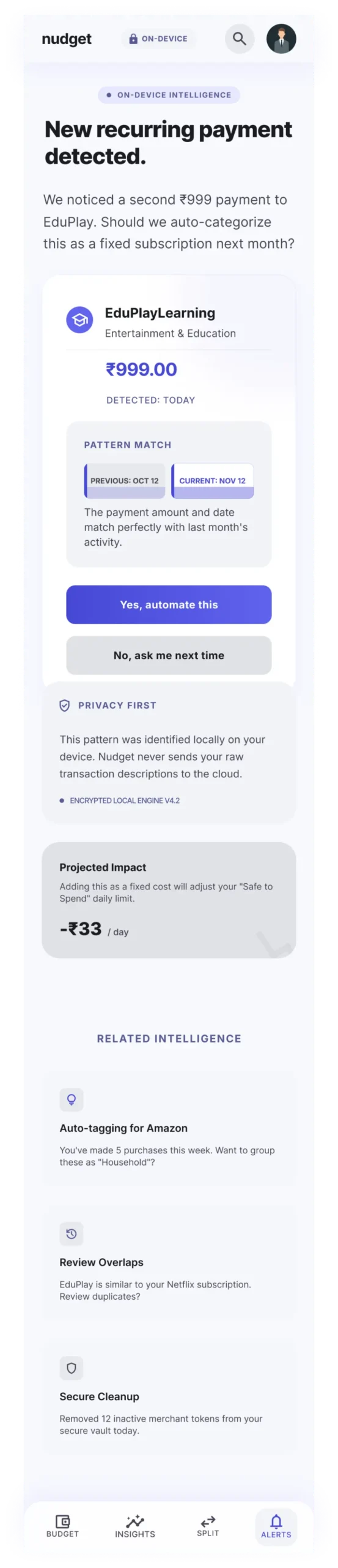
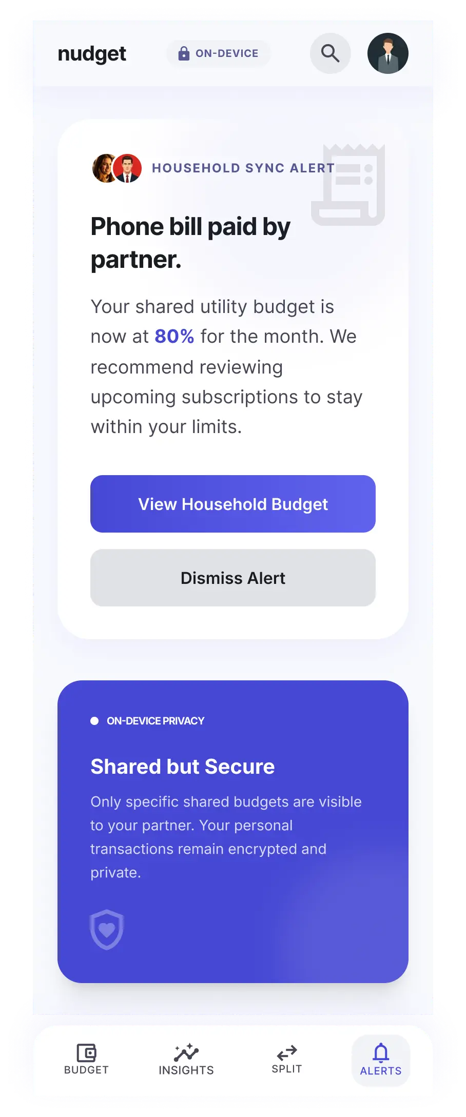
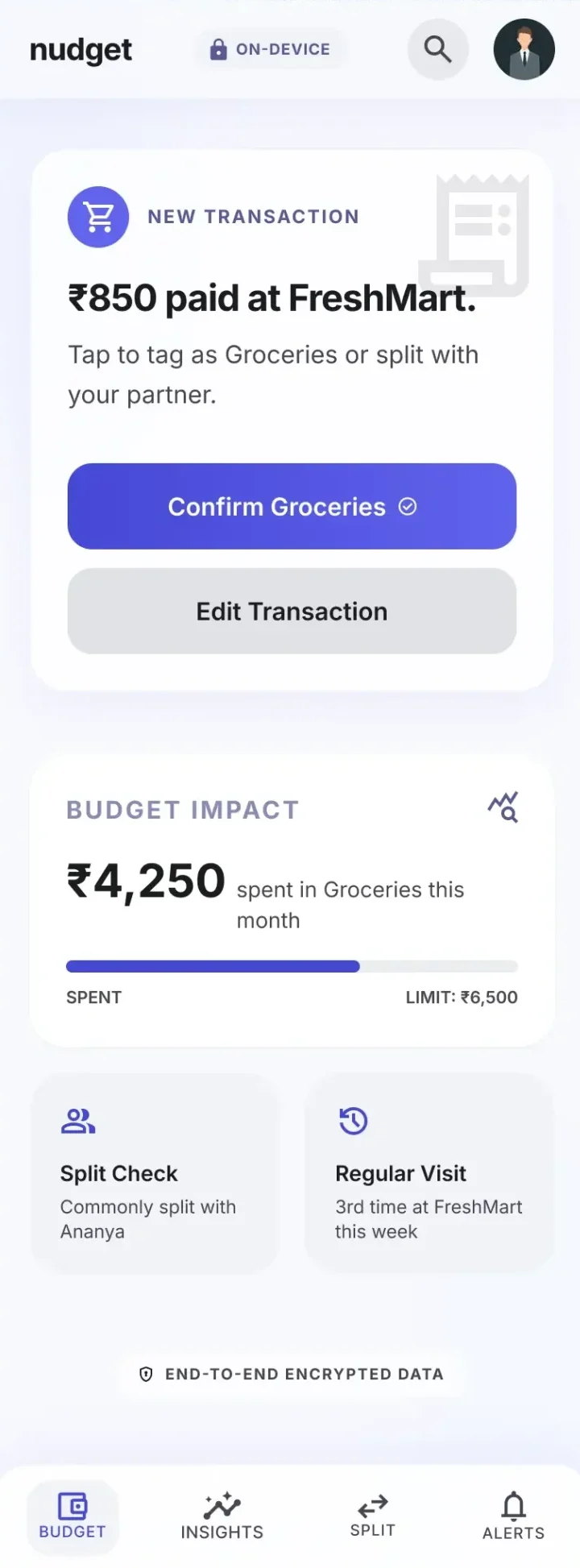
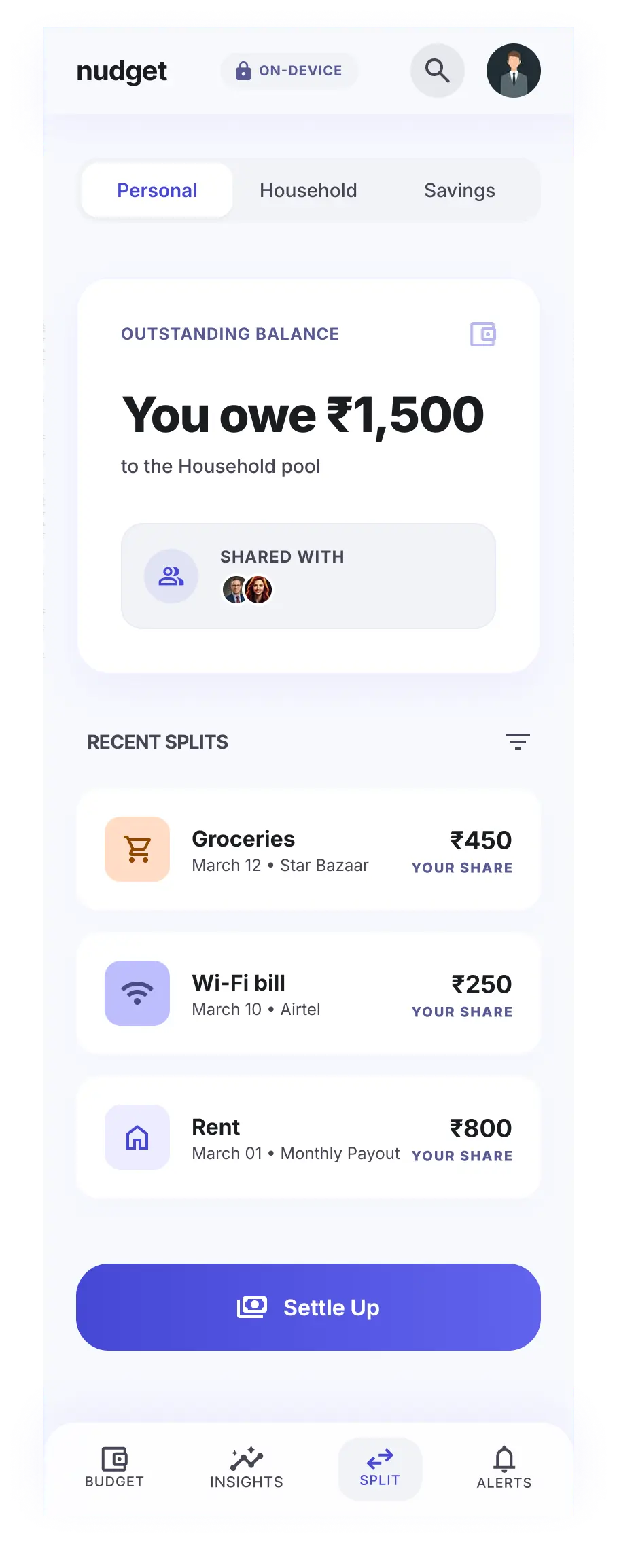
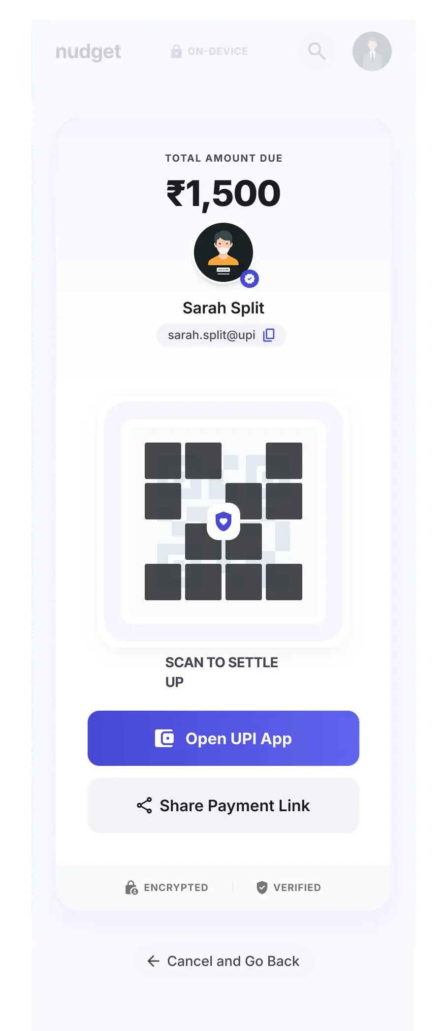
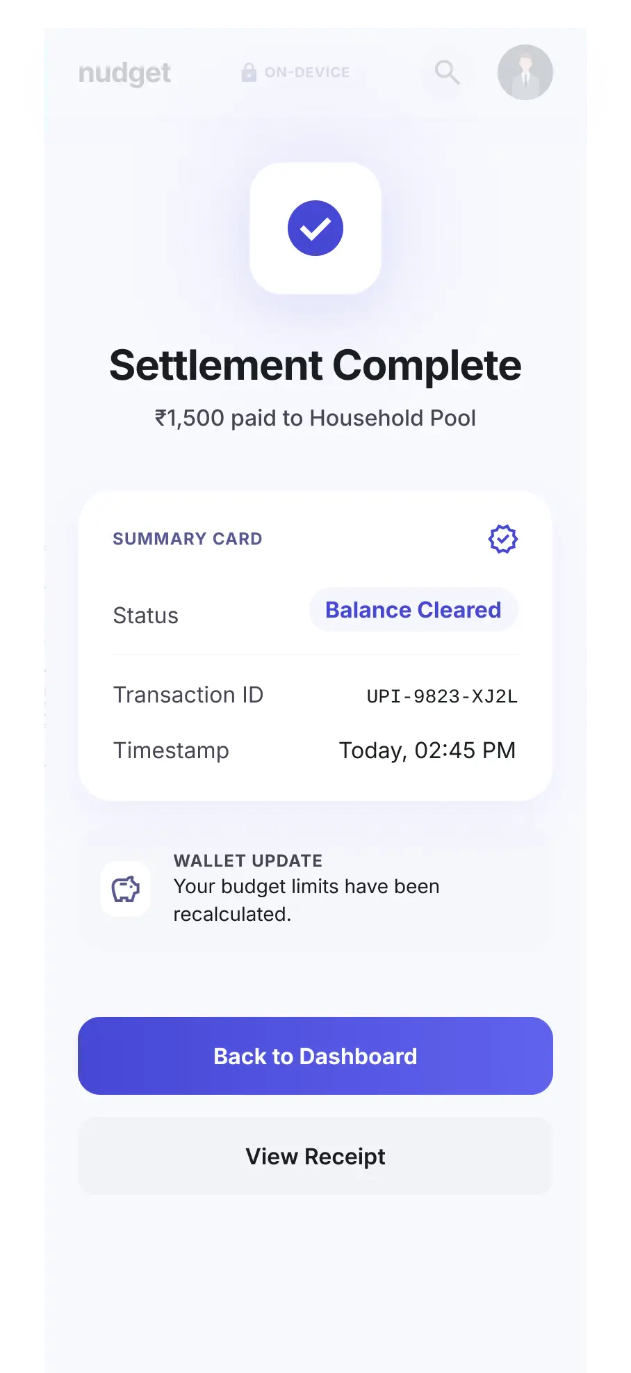
Designing an Interface that stays calm most of the time and only lights up when something needs your attention, like an overspending alert. Info surfaces in layers not all at once, so a casual glance and a deep dive are both easy.
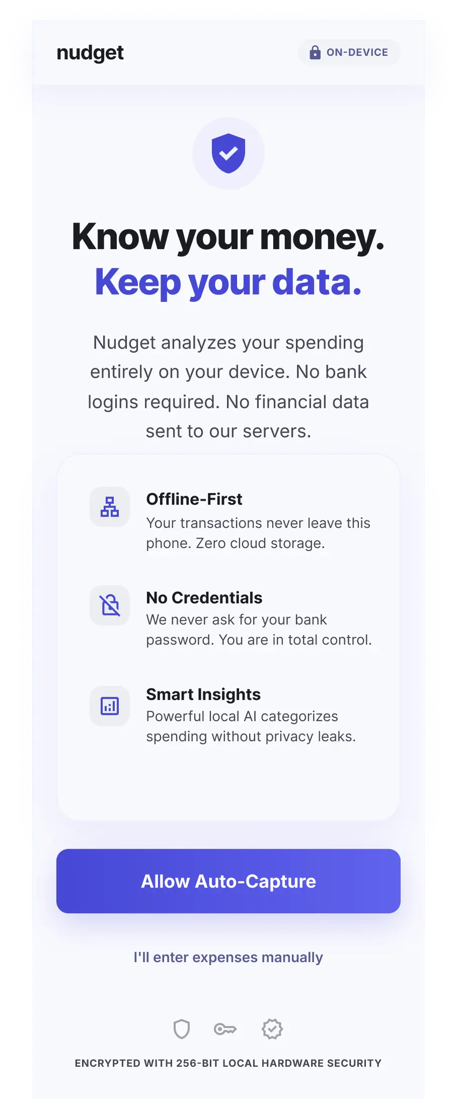
One: Meaning Over Metrics
One of the strongest research findings was that users already knew their financial goals.
What they lacked was clarity on whether they were moving toward them.
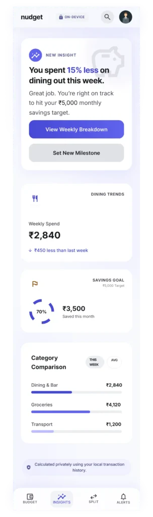
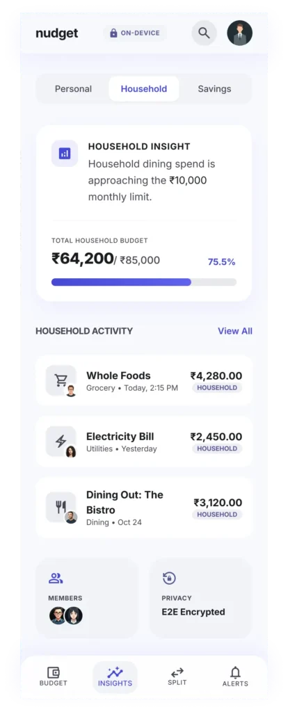
This is what the dashboard decision was built to solve. Manual Organizers didn’t need another ledger to maintain, they needed the payment methods they were already burning out on translated into a single answer: on track or not.
Two: Progressive Disclosure
Different users needed different levels of detail.
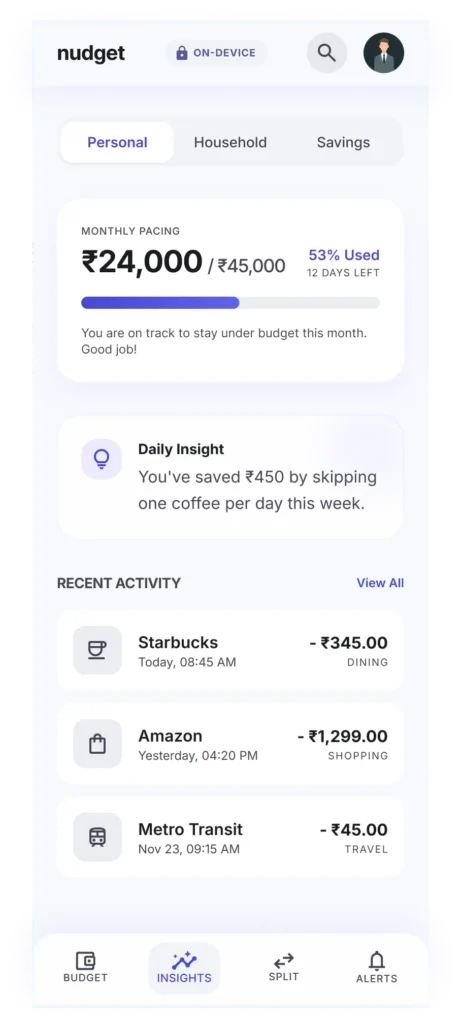
The interface surfaced high-level financial signals first while allowing deeper exploration when desired.
It’s also how the product served two archetypes at once without compromising either. One screen, two needs: a quick glance for Passive Trackers and room to dig deeper for Manual Organizers who still wanted control.
Three: Focused Visual Hierarchy
The visual system prioritized readability and attention management.
This is the Trust decision made visible: an interface that stays quiet unless something needs attention doesn’t just reduce noise, it’s proof and not a claim, that the product isn’t trying to hook you the way the apps Privacy-conscious users had already abandoned did.
What I took away from this experience

Somewhere along the way, Nudget stopped being an expense tracker and became something closer to a relationship tool. For how people relate to their money and in shared households, to each other. The real work wasn’t the UI. It was protecting people’s autonomy while helping a bootstrapped startup find a market position it could actually defend.
What I don’t have yet is user data past the prototype stage. This is still pre-launch.
What I do have is conviction that we didn’t trade away the thing that made the product different in order to ship faster.